4 min read
If your role is in HR, one of your great challenges is how to get employees engaged with the benefits you provide them. A crucial part of getting employees to engage with an online portal is getting the user experience right. You want to make the experience as simple and fluid as possible, so that employees reap the benefits quickly and easily. If they don’t, there’s a good chance they will drop off, and never bother looking at the program again.
When you’re considering implementing a new online product or service, you’ve got to get the user experience right in terms of both information and interface. If you get it right, you succeed in embedding the benefit into employees’ lifestyles where it can be useful to them on a regular basis. But that’s easier said than done. Here are some of the barriers that could be standing in the way of employee engagement.
Information:
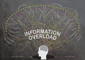
1. Information overload. We’ve all been there. Like most HR professionals, if you’ve got a comprehensive benefits package, you want to shout about it. In order to appeal to as many people in your workforce as possible, the logical solution is to cram as much information as possible onto your portal homepage.
Yet research shows that too much information is overwhelming for users, and turns people off. Think about what appeals to the majority and be selective about what you promote. If you have the option, keep it fresh by changing the headline information month by month to target different sectors of your workforce.
2. Irrelevant information. Static benefits hubs that stay the same all year round can be a real barrier to employee engagement. Employees may log on once or twice, but they will stop returning if they think there’s nothing new to appeal to them. Being able to change your engagement hub in tune with different seasons or company events of the year will keep staff coming back to find out about the latest benefits. For example, if you are opening a Cycle to Work window in Spring, you need your portal to reflect that.
3. Wrong order. Similar to relevancy, if the order of information on your hub is static, there’s a risk employees won’t see your updates. The hierarchy of what to place on the page is extremely important when designing your engagement hub and needs to stay fluid to capture employees’ attentions at different points of the year. If you’ve got a deadline for auto-enrolment coming up, it needs to be big, eye-catching and up top, whereas ‘take your dog to work day’ may deserve to feature nearer the bottom of the page.

Interface:
4. Bad navigation. A badly designed user journey can have a negative effect on employee engagement for the sheer and simple fact that employees will give up if they can’t find what they are looking for. If you’re designing an engagement hub, the navigation should be simple and clear. Don’t display everything up front; you’ve got to create a logical user journey with a flow that makes sense. Think about what’s important to you as a business to inform a logical hierarchy of categories, and only present the user with top level choices that matter.

5. Getting lost in the maze. No one should ever have to click more than 3 times to find the information they are looking for, so don’t overcomplicate your site map. Think carefully about where to place things on the site, and don’t make things difficult to find. For example, corporate gym discounts might belong under health and wellbeing > discounts.
6. Unclear calls to action. If you want your employees to act on the information you display, you need clear and persuasive calls to action. Whether you want staff to apply for something, answer a survey or purchase discounted gift cards, whatever the action, the interactivity needs to obvious. For example; buttons need to be big, eye-catching and look clickable.
7. Unresponsive. It is an undisputed fact that your employees will want to access their program on mobile and tablets most of the time. That's why we made sure our engagement platform; SmartHub™ looks beautiful on every device. No excuses; it needs to be usable on smartphones, tablets and desktop. If not, you’re stuck with the biggest employee engagement barrier of all.
If you think carefully about user experience and follow these simple rules during implementation, you’ll create long lasting employee engagement with your online platform.