Employee Engagement Platform
The Engagement Platform powering the world’s best businesses.
Bring your employee experience together in a mobile-first platform engineered for tomorrow's workforce. Employee benefits, recognition, rewards, communications, wellbeing, and integrations with your existing systems work together to multiply engagement, support your people, and motivate your workforce.


Today’s workforces have a problem. Meet the solution.
The modern workplace is rapidly changing, but low engagement, high turnover, and a lack of productivity are holding businesses back. Bring back the joy and watch your people thrive with sophisticated, personal engagement programs that meet the moment.
Stress, burnout, and cost-of-living pressures are killing your engagement and productivity. Give your people the support, recognition, and incentives they need to excel.
56% of employees considered leaving their job in the last six months. Think beyond salary with a modern, scalable EVP built to attract and retain the modern workforce.
Bloated tech stacks and self-managed solutions lead to low adoption and admin overload. Consolidate engagement into one seamless platform that multiplies impact and reduces HR workloads.
Total engagement. One platform.
Bring all your engagement initiatives together in one custom-branded, mobile-first platform engineered to deliver joy across every employee touchpoint.
Employee Benefits
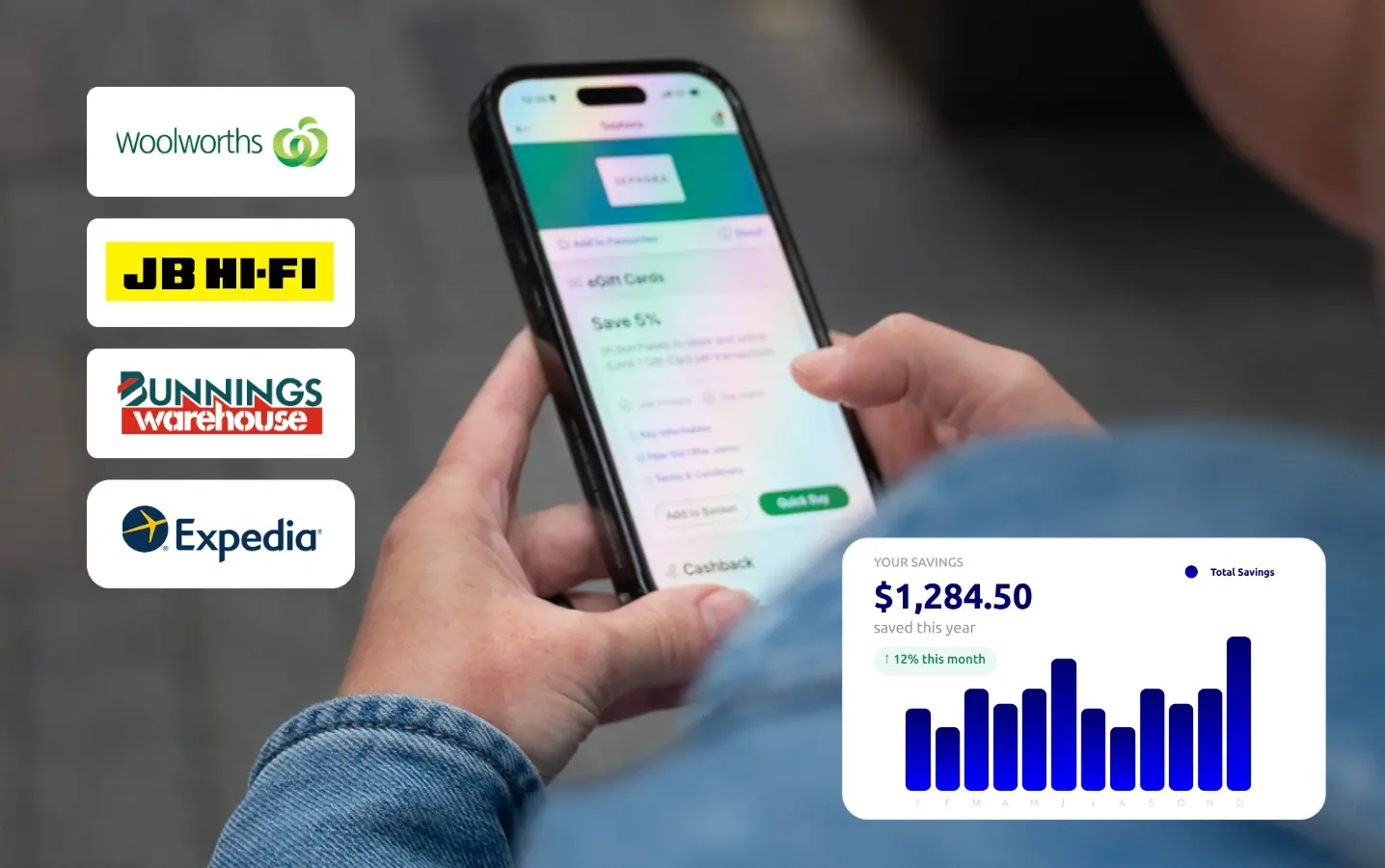
Transform your Total Rewards strategy with employee benefits that feel like a pay rise. Thousands of discounts across the globe deliver the financial support and competitive benefits required to build an engaged and productive business.
- Discounts from thousands of retailers
- Global discounts offering
- Personalised offers
- Mobile-first shopping experience
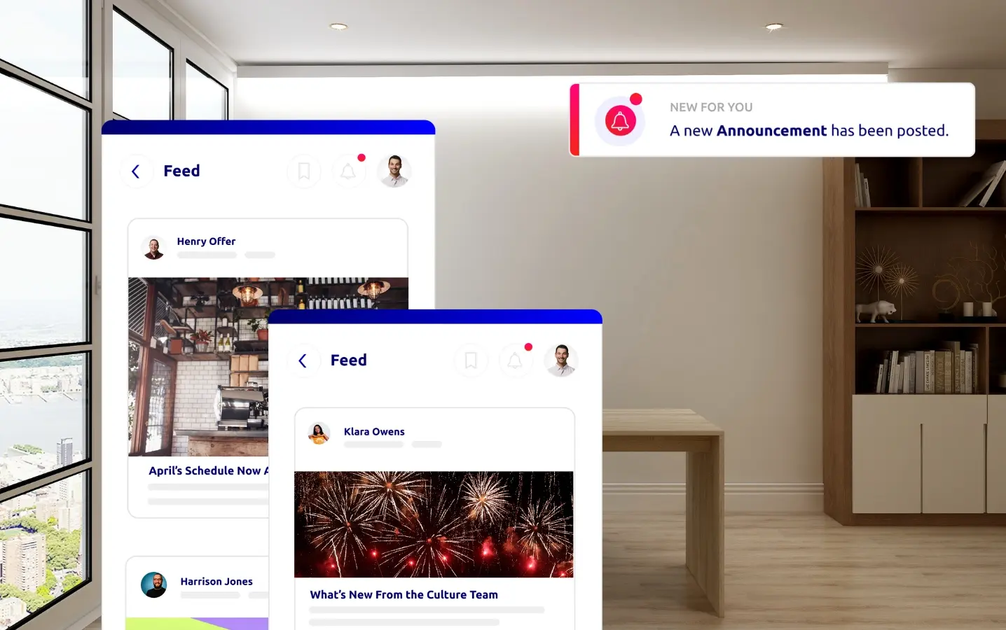
Employee Recognition
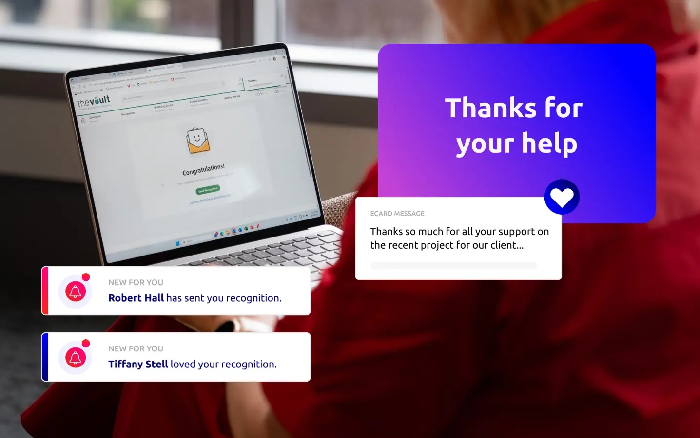
What gets recognised gets repeated. Shout-out colleagues, spotlight success, and celebrate milestones with custom-built recognition programs that elevate connection, engagement, and performance.
- Peer-to-peer and manager-led recognition
- Automated milestones
- Personalised and targeted
- Mobile-first social feed
Rewards Programs
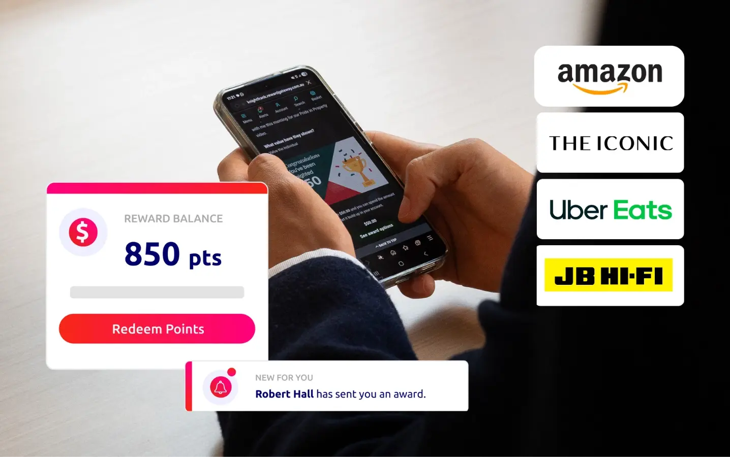
Deploy a systematic rewards program that reinforces positive behaviours and incentivises high performance. Reward achievements and milestones and transform appreciation into tangible value that drives the outcomes your business demands.
- Manager-led and automated rewards
- Global Rewards Marketplace
- Transparent pricing and no hidden fees
Internal Communications
Our communications platform reaches office-based, frontline, remote and global employees with targeted announcements, shared resources, and social engagement that drives connection and performance.
- Advanced segmentation and scheduling
- Mobile-first comms
- Social features
- Employee profiles and directories
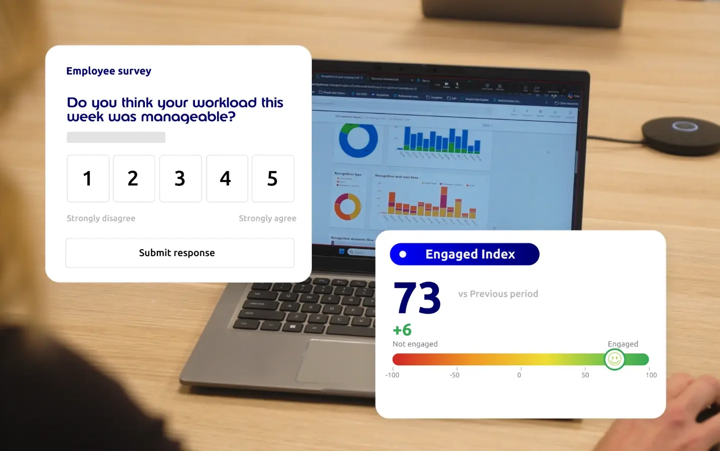
Engagement Surveys
Capture real-time employee sentiment with sophisticated survey tools ranging from quick pulse checks to comprehensive engagement assessments. Monitor program performance, identify risks, and drive continuous improvement with feedback technology that transforms employee feedback into strategic action.
- In-depth surveys
- Employee Polls
- Employee NPS
- Engagement Benchmarking
Employee Wellbeing
Comprehensive employee wellbeing programs featuring expert content across physical fitness, mental health, nutrition, and financial wellness. Hundreds of videos, articles, and practical tips deliver moments of joy that reduce stress and help employees thrive.
- On-demand content on any device
- Customisable wellbeing hubs
- Regularly updated library

3rd Party Integrations
Integrate with existing employee platforms for more impact with less admin burden. Reduce systems fatigue, eliminate fragmented benefits, and reach your people through their daily workflows.
- Bi-direction data sync with your HRIS
- Push content to messaging platforms
- Consolidate your tech stack
- Ensure privacy, security, and easy access
.webp)
Engineered for tomorrow's workforce
Every employee is different, that’s why our engagement platforms are engineered to reach, engage, and drive daily usage from every employee. Wherever they are and however they work.


Global engagement programs
Multi-national programs that deliver global reach with local relevance to all your people.
- Discount or reward offers in 65+ countries
- Available in 70+ languages
- Localised region hubs
AI-powered engagement
Our AI Assistant connects your people with real-time answers and assistance that let them thrive.
-
Understands your policies and procedures
- Friendly content directory
- Instant help for onboarding and adoption
- Private and secure

A engagement platform built for you.
Across our thousands of clients, no two platforms are the same. Unify your engagement strategy and let your brand shine with custom-branded, mobile-first employee hubs purpose-built for your unique organisational goals.

Leaders in engagement tech
Spend less time managing software and more time adding the human touch with configurable workflows, powerful automations, and industry-leading security that puts your engagement program on cruise control.
Industry-leading information security


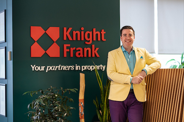
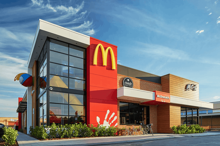
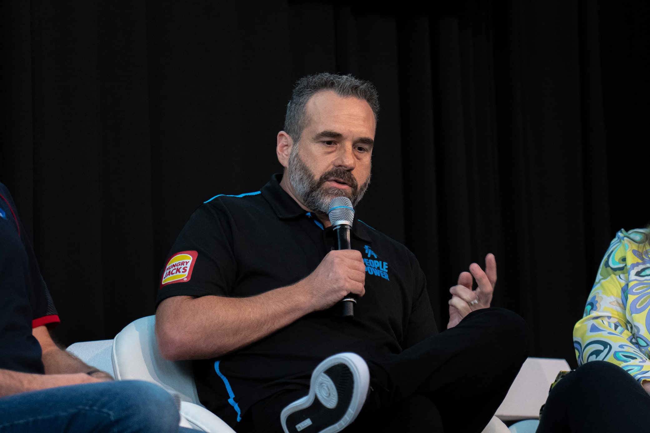
Trusted by leading HR teams


Expert insights on employee engagement
Discover new ideas, stories, and resources that help you support, connect, and engage your workforce.

Signs You Need an Employee Experience Platform
Explore the different ways an EXP enables organisations to meet the total needs of the workforce.
.png?width=2000&height=1500&name=marketing-led-hr-cover-image%20(1).png)
Marketing-Led HR: Practical Steps to Drive Employee Benefits Uptake
Discover why thinking like a marketer may be the key to unlocking greater impact of your benefits programs.

The Workplace Engagement Index 2026
Discover what's driving engagement, productivity, and retention in 2026.

Discounts
Personalised, mobile-first employee discounts that feel like a pay rise.

Recognition
Elevate workplace connection, engagement and performance.

Rewards
Accelerate performance with rewards and incentives built for everyone.

Wellbeing
Create happier, healthier workforces with personal wellbeing programs.