How to Make HR Technology More Accessible | Reward Gateway AU
In recognition of Global Accessibility Awareness Day, we share four ideas on how to make your HR technology more accessible and user-friendly. Learn more!

Celebrating Accessibility Awareness Day
As part of our ongoing commitment to improving Diversity, Equity & Inclusion at Reward Gateway, we have created a series of networks to facilitate greater representation of voices within our employee base. As a part of this, the Accessibility Network was formed last year alongside other networks (Multicultural, Women’s, LBGTQIA+, Intergenerational).
The mission of the accessibility network is to help in ensuring that Reward Gateway as an employer, and Reward Gateway products, are inclusive and accessible to everyone.
 And so with that, you may start hearing from our various network leads as we share more around these important days or months on our blog. I’m excited that the first of these is around Accessibility Awareness Day, which is today!
As a network lead, I’m proud to work on our product team to make sure that our employee engagement HR technology is accessible, and part of this meant the development of our own internal Accessibility Statement.
This year, I want to recognise Accessibility Awareness Day by sharing how accessibility not only matters in the internal world we have here at Reward Gateway, but should be top of mind for everyone, no matter where they work or what they do. We shared the below on our own employee engagement platform, boom! as part of our regular communications to employees, and I was delighted by the conversations that sparked from it!
While many of these tips can be applied to digital, HR tools, we tried to think beyond the usual advice to hopefully bring you a few things you may have never considered:
Presentation
 I’ll start with a really interesting one that I think pinpoints how interesting and surprising accessibility thinking can be. Imagine it – you are a blind person at a conference. You hear the presenters saying their names but you have no idea who they are, how they look, you are completely unaware of an integral part of one’s personality. How big of a difference it will make to actually describe yourself when you start presenting? For most people it might sound strange but for a person with poor eyesight (or standing at the back row even) it might be of huge importance. So next time when you are doing that you might say that you’re 'a tall, mid-30s white male with a long beard who needs to do a bit more running if they want to stay fit…' That’s probably not what you should say, but you get the point.
Colours and contrast
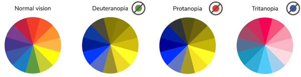
From poor eyesight to complete blindness and different types of colorblindness, this type of disability affects or will affect most of us as we age.
You need to think about colours any time you use text on a colour background for example. If you need to keep it simple just make sure that text is not too light (yellow text on white background), the contrast is too low, you used too many colours or a busy background.
If you want to properly test your choice of colours there are multiple tools you can use to determine if they are accessible. Here’s a friendly one you can use in your daily work.
Another great tip is to avoid relying on colour to convey meaning. People with colour blindness cannot distinguish colours easily so always back up colour with explanation and graphic or an icon. Here’s an interesting simulator of how different people perceive colours.
Fonts
When reading text, most people do not read or parse individual characters or even words. Instead, the eye quickly scans through text and parses patterns and groups of characters (typically 6-9 characters at a time) which are nearly instantaneously converted into meaning by the brain. This subconscious process allows us to read and understand text content very quickly with high degrees of understanding, even though we aren't even seeing or thinking of characters and words.
Dyslexia and cognitive disabilities make this process very different for some people. That’s why it is important to make it as easy to understand and digest information quickly.
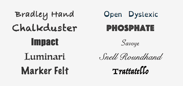
- Pick fonts or font families that have strong and unique characters because for people with visual impairments or dyslexia, certain letters or combinations of letters can be confusing, so it’s important that letter shapes are clearly defined and unique. Common offenders are the 'I' (ex. India), 'l' (ex. lettuce) and '1' (ex. one).
- Be cautious when using multiple typefaces in the same document or web page. Ensure that typefaces/fonts align with types of content, such as one typeface or font for headings and another for body text.
- Besides picking a common font family and paying attention to character uniqueness, make sure you avoid using fancy or handwritten fonts and/or fonts that only have one character case available. Specialty fonts with cursive, or unusual shapes, or artistic features, may look nice, but they are much harder to read than common font families.
- Avoid using font variations such as italic, bold, ALL CAPS, underlining things that are not links or other styling methods that may make the content difficult to read.
Images
Images are an integral part of how we perceive everything around us. You know the saying, right? An image is worth a thousand words. It is a bit different when we talk about accessibility. You can of course use bright, bold and beautiful images but there are a few things you might want to pay attention to.
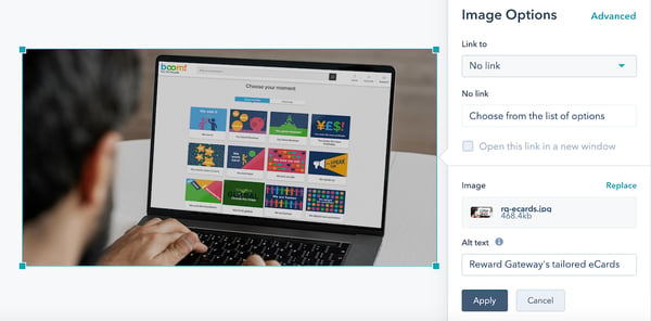
Make sure your images have captions and alt text. 'Alt text' is a contraction of 'alternative text.' It's a short written description of an image, which makes sense of that image when it can't be viewed for some reason.
It's read by screen readers in place of images, allowing your image content to be accessed by people who are blind or have visual impairment.
It can be useful to people with certain sensory processing and/or learning disabilities.
It's displayed in place of the image in browsers if the image file hasn't loaded, or when the user has chosen not to view images.
It's not just your website where you're in control of image alt text. You can also add alt text to the images you upload to Twitter for example.
Tips for writing 'good' alt text
- Be specific, and succinct.
- Never start with 'Image of …' or 'Picture of …'
- Include text that's part of the image.
- Don't add alt text to images that don't have any contextual significance or meaning and won't help people understand the page better if given alt text.
A major thing to avoid when using images is to have text in the image itself. That text won’t be read by the assistive technology the user might use. Additionally, text within images can become more pixelated, blocky, and difficult to read when enlarged, such as may be necessary by users with some visual disabilities.
We’re not done with our own accessibility awareness when it comes to our product sets, and I should also mention that we’re looking at our own website (the one you’re on)! to make continual improvements.
When developing our solutions, we always make sure they are accessible to the widest possible audience. Designers, Developers, and Quality Assurance Specialists make sure our products meet accessibility standards and enable assistive technologies, but if there is a feature that you think we are missing, please let us know. You can reach out to me directly on LinkedIn and I’m happy to talk to you more about how we’re making our products more accessible for our clients.


